 Stride Post Latest News
Related Articles


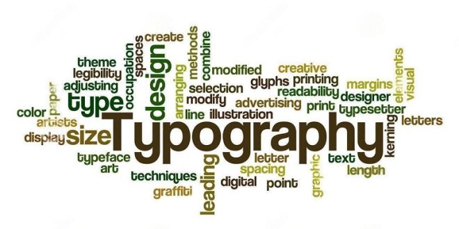
As everything has turned digital, we spend most of our time online. And definitely, we get to learn a lot of interesting stuff. However, in the current scenario, you might have encountered that typography in photography is getting trendy. Moreover, it looks quite beautiful as well.
If you haven’t tried merging typography and photography, you are surely missing out on a really interesting aspect of photography. Please, don’t feel left out. We have created this interesting and informative piece of write-up that will guide you to add beauty to your photoshoot and help you how to use typography. So, let us dive into it.
When to Use Typography in Photo?
It is not necessary to have typography for your photos. But it is used to add that additional beauty to your pictures. However, there are certain places where we can use typography and can add up extra value to the picture as well. While on the contrary, it may look quite off and unattractive if you use it in every picture. In addition to this, you can also think of using it on wedding photo albums or even for branding. Read more about Photo To Cartoon
Tips for Using Typography in Photography
Let us dive into the latest tips for using typography in photography.
Focus on the Color
The color of the typography is an important tip. Adding a touch of color adds visual interest to the picture. In such cases, it is crucial to check the color of the project surface. Nevertheless, it is advised to choose a solid contrast. Although it is not necessary to opt for the solid one but generally advised to opt for a black or white color. You can even opt for color separation for better results.
Include the Text in Your Image
At times, the text becomes an important part of the image. For this, you will need the image and text to work with in most cases.
Blur the Background
One of the most important yet simplest tools is to blur the image or any part of it. Adding a touch of blur to the background will make your picture stand out from the rest of the bunch. In addition to this, blur also helps to add focus to the overall segment of the image. The reason the blur tool is used is it maintains the focus on the product and the text in photography into a sharper focus.
Opt for the Standard Font
Choosing the standard font is one of the essential tips for using typography in photography. It is important to have absolute clarity in terms of the font so the viewers can read it properly. Moreover, the text becomes all the more hazy after entering the printer resulting in difficulty in reading.
That is why it is extremely important to ditch the stylish font and stick to the standard font. It is an understood fact that the beauty of typography and photography will go unnoticed if the viewers fail to read them. And as it is suggested that we should keep it simple, the same applies to the font. Here, you can opt for the best typography fonts to make a statement.
Stick to a Consistent Format
After getting done with typography style, contrast, and other factors, it is important to dwell focus on the format. No matter which format you opt for, be it bold or italic, it is important to stick to one format. However, the size of the format also plays a vital role in terms of the format. And do not enlarge the format to a great extent. Instead, choose an easily readable font.
Be Careful with the Alignment
Just checking the format is not enough. Having an alignment amongst the pictures is also necessary. It is suggested to ensure that the text has perfect alignment. It implies the position of the text and from where does it start.
The main aim is to let the viewers read what is written. That is the reason why keeping the alignment appropriate is integral.
Follow the Hierarchy
In the field of photography, hierarchy plays an important role. The visual hierarchy focuses on different types of colors, styles, patterns, etc. It reflects your work and nobody likes to view scattered and mismanaged work. That is why it is suggested to maintain the hierarchy and composition in photography.
How to Use a Text Over an Image?
Typography design is hitting the market trend at high speed. Let us familiarize ourselves with the various techniques of using text over an image.
Pepper Up With the Contrast
It is essential to have readable and clear text, and it is a win-win situation when the color of the text is different from the image. Focusing on the typography color is important, or else the viewers will get confused about the image and the background.
And we are nowhere neglected by the fact that contrast always accentuates the beauty of the picture. For instance, if the background is black, then opt for a lighter shade or classic white for the text. This contrast will surely induce beauty to the picture. Along with this, the viewers will be able to divide their focus equally on the image and its background.
Let the Image Include the Text
As the text is included in the image, let it become a part of it. However, it could be a little difficult to achieve, but it is still possible with some practice. In such a case, you can opt for a simple image that will ease your task. You can even rely on typography photoshop for better results.
Stick to the Visual Flow
Managing the visual flow of the picture is one of the important aspects of typography. Let the typography fit in the logical segments of the image. However, please ensure not to place the text on the important elements of the image. Or else it will take away the charm of the picture.
As far as visual flow is concerned, look for the places where you can place the text without harming the beauty of the image. And if there are some unwanted elements in the pictures, please ensure to remove them by editing. If you feel it might be difficult for you to manage, then do not hesitate to take help from a company that provides photo retouching services.
Try Putting the Text in a Box
When we place the text in a box, it directly lets the views divide their attention equally. Or else, if the text is not framed, and if the image has a lot of elements, it will disturb the focus of the viewers. That is why it is suggested to frame the text to make it seem attractive to the viewers.
Closing Words on Typography in Photography
Here you go! Now you learned the complete dynamics of dealing with typography in photography. You can definitely try it and create a beautiful blend of typography and photography. And if you feel too overwhelmed, then a leading company that is proficient in photo retouching services and can beautify your pictures. Don’t feel stressed in wondering whom to trust. We, at IIPVAPI, provide the best photo retouching services. So, get in touch with us to make your photos look absolutely perfect.
